1981: Kelly Emberg
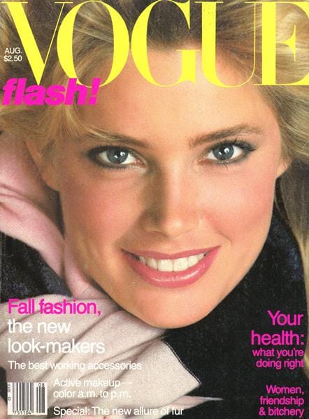
The words under the masthead never fail to be dopey, but this particularly looks like an entreaty for someone to rip open their trenchcoat.
1982: Brooke Shields

She looks amazing in this cover, but she was also only 17. That's SO YOUNG to me for Vogue, but I guess they figured she... skews mature?
1983: Isabella Rossellini

It's as if Vogue doesn't care if you actually experience success; just that you LOOK like you have.
1984: Isabella Rossellini

And here, Isabella has veered into the years when Vogue's chief cover direction seemed to be, "Open your eyes wider and then DON'T BLINK FOR AS LONG AS POSSIBLE." Also she looks like she's in the middle of a ski holiday.
1985: Alexa Singer

She looks like Anne Hathaway to me, and it's kind of criminal that she's obviously wearing a LOT of gold lame -- including GLOVES -- and we see none of it.
1986: Cindy Crawford

This is a 19-year old Cindy Crawford, employing a LOT of hair spray and probably also a wind machine.
1987: Estelle Lefebure

That hat says, "On top, you, say? MMMHMM."
1988: Stephanie Seymour

Yes, apparently this IS Stephanie Seymour, and I NEVER EVER would have gotten there without the Internet helping me. (Now that I know, I can see it?) And she MUST be stressed, because she is about t nibble that pinky finger right off.
1989: Tatjana Patitz

Last month I called her Elaine Irwin, and I almost did it again. Either they look alike, or I am totally Patitz-blind. (Also, you guys, the 12-year old in me -- who had her name made fun of all the time, so I get it -- snickered very hard at them using "bush" and "natural" together in one cover line.)
1990: Claudia Schiffer

I don't care how chill Claudia looks; fashion's "ease" has never involved a French twist.
1991: Karen Mulder

It IS nice to have the camera back and giving the model breathing room, even if said model looks like she's just trying to cross the street.
1992: Christy Turlington

This outfit is ridiculous, but Christy Turlington looks amazing and almost makes me think suspenders and a belt pair well together. (Almost.)(Well no, but look, she's an outstanding model.)
1993: Cindy Crawford

This is nice and simple, and while initially I thought it needed to move down a cover line toward her feet, I get that leaving it this way showcases her shoes -- and it IS a boot-focused issue.
1994: Karen Mulder

In two of the last six issues, Anna focused on Donna Karan; in two others, it was Calvin Klein. Diversify, Anna!
1995: Linda Evangelista
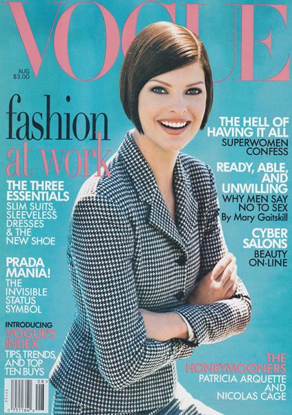
How is Prada an "invisible status symbol"?
1996: Gwyneth

I hate the color scheme of this cover, but it's a fairly charming pic of Gwyneth.
1997: Georgina Grenville
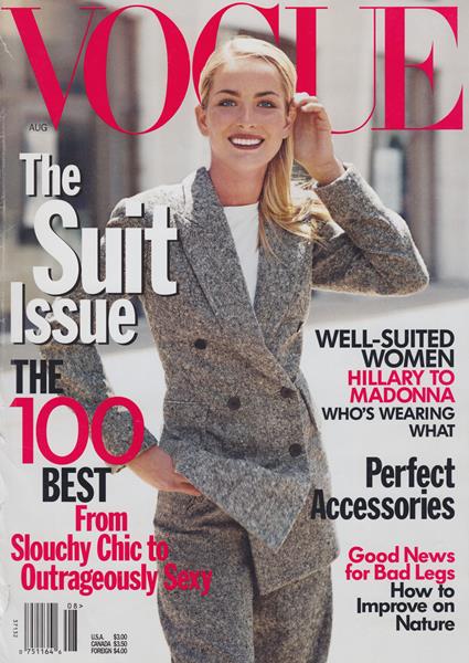
"Good News for Bad Legs" is the kind of sleekly bitchy headline that I can imagine Anna pitching behind her giant shades in a staff meeting during which every person in the room surreptitiously tries to figure out if their legs were the inspiration.
1998: Carolyn Murphy
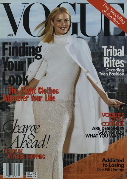
She looks like Shailene Woodley to me in this shot, and that is not a comparison I would ever have thought to make any other time. I do want to read about revenge shopping, though.
1999: Carolyn Murphy

Like here, for example. Not a Shailene resemblance. (Also I read that as A MOTHER A DAUGHTER A FORKLIFT, which is a story I would rather read.)
2000: Carmen Kass

I wonder what makes you the world's best sperm bank. Like, what are the criteria here? Volume?
2001: Amber Valletta
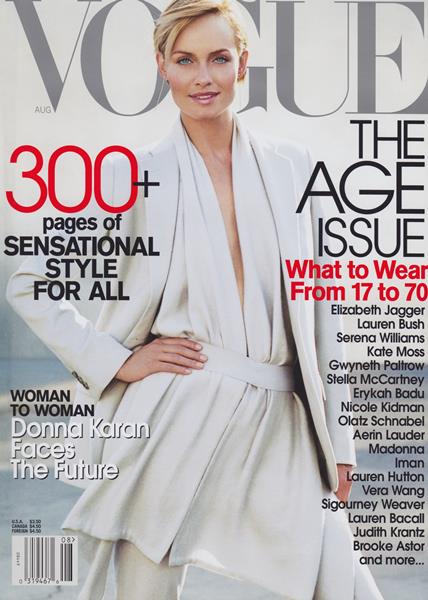
MORE Donna Karan! They must be pals. Or, and this is probably truer, DKNY and Donna Karan's line must both have been big advertisers.
2002: Jennifer Aniston

This is cute of her, but also, because of the angle and the light, she almost doesn't have a nose. It's like if she were taking style cues from Voldemort.
2003

This cover has none of her zest.
2004: Priscilla Presley, Lisa Marie Presley, Riley Keough

The genes are strong with this family, but also, they're posed like this is a nighttime soap called THE PRESLEYS -- it would be the poster for their E! reality show -- on which Priscilla is trying to steal Riley away from Lisa Marie and LM is hella peeved about it.
2005: Madonna

Narrator: It was not, in fact, the last time. (This cover is ridiculous. I get that she's supposed to look like a giddy mummy of the manor or something, but she's just hunchy.)
2006: Linda Evangelista

She looks surprised to be here. A cover with a story called REVENGE OF THE SUPERMODELS needs to a) have a better shot of said supermodels, and b) possibly several of them.
2007: Winona

"Am I doing this right? Do I really have to be starting over or can I just be continuing? Is this okay? What am I doing here? Does this feel like me?"
2008: Kate Moss

Oh, Vogue, don't tell people to tweak their faces. Sit down.
2009: Christy Turlington

"Party pleats"? Are those pleats with darker eyeliner?
2010: Gwyneth

Second acts is a nice idea, but I feel like GOOP's as a "queen of the kitchen" was just a way station, really, and always the work of ghost writers.
2011: SJP

This cover line was tied to SJP in "I Don't Know How She Does It." I guess this cover isn't terrible? But it leaves me a little cold. It's kind of smug -- not because of anything she did, necessarily, but the combination of the cover line and the facial expression. I'm sure she does it with a lot of help.
2012: Marion Cotillard

This is lovely and a little chilly, but in a way where I want to hold her gaze.
2013: Claire Danes

Her face has been way too retouched.
2014: Blake Lively

This is pegged to her short-lived site Preserve, and I will always take the moment to link to the semi-facetious quiz we did to test whether you can tell the difference between her site's purple prose and that of the J. Peterman catalog.
2015: Nicole Kidman

She looks cold, as if her dress busted open and they can't find her a coat.
2016: Gigi Hadid and Ashton Eaton

I mean, it's a great shot of Gigi, but just let the athletes have their moment.
2017: Gigi and Zayn

Smart money is on them getting another cover post-baby.
2018: Saoirse Ronan

This is very striking. And also a bit startling. It makes me feel... empty, as if she, too, feels hollow and we're now both wallowing in a mood. Which... in 2020, we might well be.
2019: Ariana Grande

The hat is hilariously huge, and it absolutely makes the cover jump out at you.
2020: Simone Biles

I kind of liked that they gave Simone a cover where she holds such physicality, because in the past they've done HORRIBLY with female athletes -- Serena Williams, particularly. But I do agree with the knocks on the lighting and some of the posing. This does not feel handled with care. The subscriber cover was better.