Priyanka on British Vogue
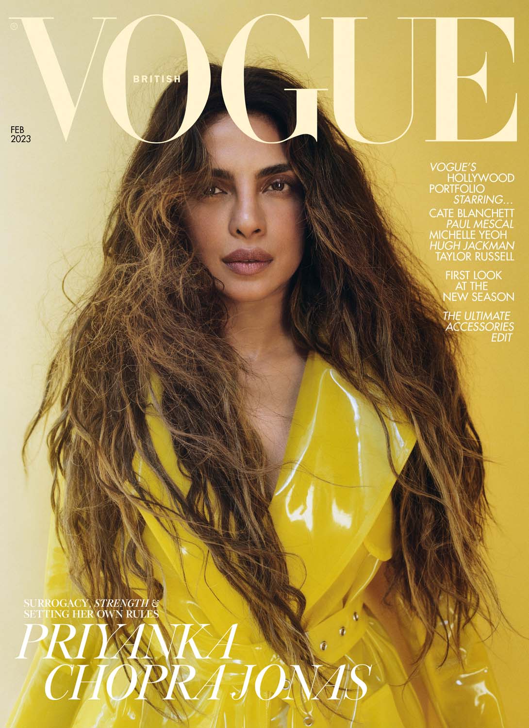
The other thing about this, besides not liking the photo, is: You can't REALLY see the smaller text very well. White-on-yellow is not great for legibility, at least not at that size. At that point, just maybe don't DO any?

I do like that these photos have a really strong primary-color theme. (There are different ones in the online piece that don't do this.) This is a bit of a weird photo though. It looks like she's trying to breastfeed through her shirt, or like Nick just asked her where the Jif is and she's yelling out suggestions.

At least her FACE looks better in this one than in the cover choice. There's still a weird aura of Lost in the Woods, but it's a nicer photo.
Priyanka Chopra Did NOT Have to Do a Valentine's-Themed Cover for British Vogue
Nice to see them lean away from pink and red and flowers.