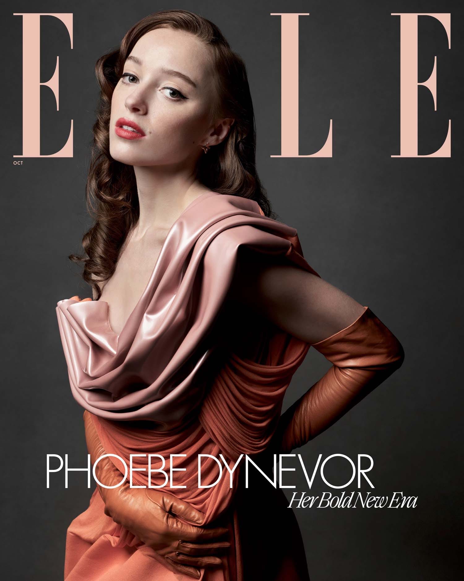
This is... fine? But a little distant. Or chilly. Both.

I'm guessing this was their second pick for the cover, or else why include it? The cover is better because at least her body is more dynamic. This almost feels like a lighting test shot that they ended up liking.

That looks like a Calvin Klein ad for a perfume called GRIEF.

IMPATIENCE. Calvin Klein's IMPATIENCE.

I can't figure out why they picked this one; the facial expression is not great.

That is a nifty pose -- this would be an amazing ad for either the gloves or the glasses.

ALSO should be a jewelry ad.

Why is this all so GLOOMY.

She has a knack for finding body shapes, but again... GLOOOOOM.

After a while it starts to feel like they just didn't edit these down enough.

This one is not bad?

At least this one feels lit nicely.