Wisconsin v Nebraska: Sept. 29, 2012
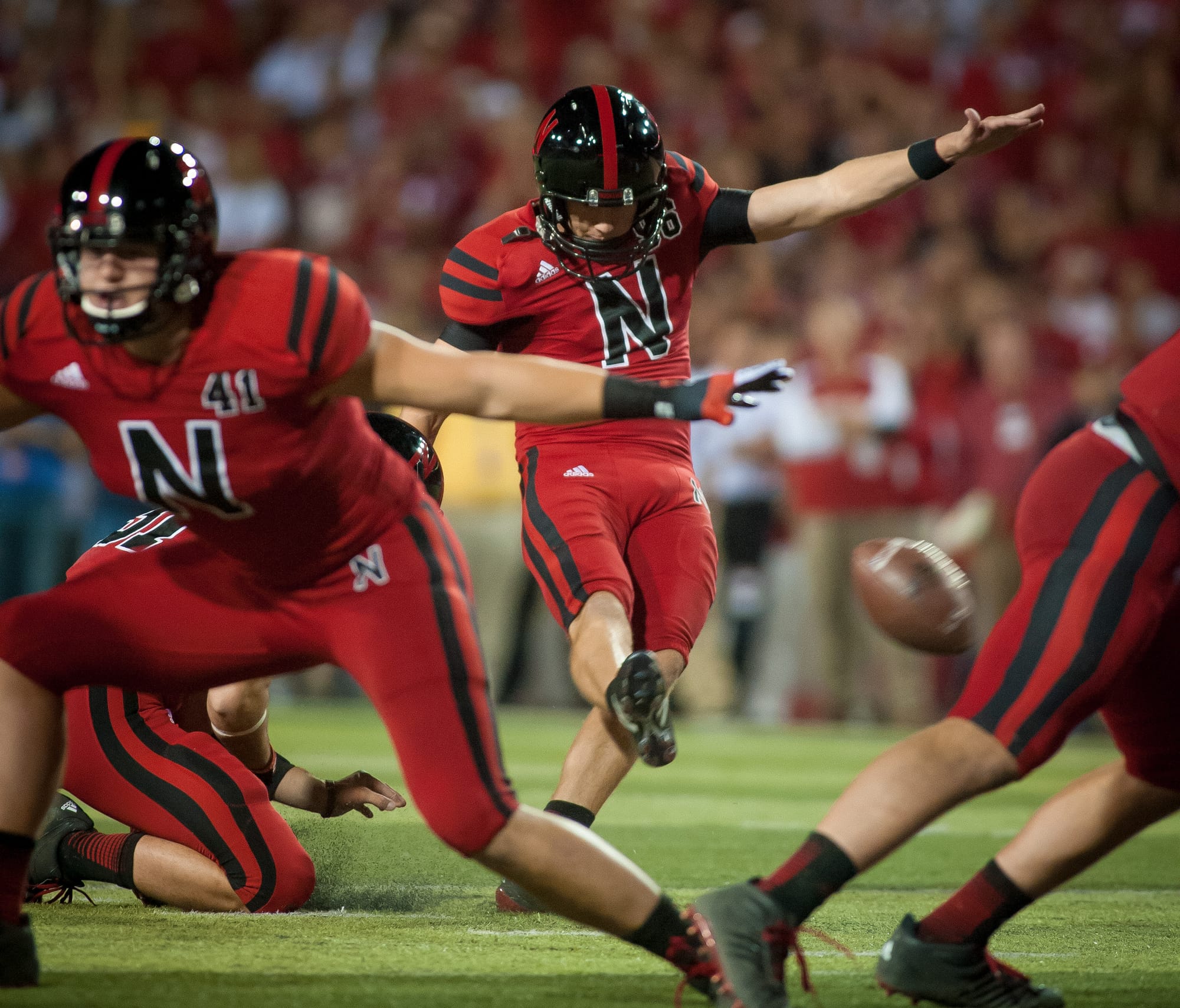
Nebraska's colors are usually crimson and white (or whatever -- sorry if I get the exact shade of red wrong, y'all). So naturally, for this big home clash against Wisconsin, they added black to the mix, threw on new helmets, and slapped a giant N on the front. It's like the world's clumsiest letterman's sweater. The officials were probably like, "What the hell is his number? N to the 41st power? THAT IS NOT HELPFUL."
Wisconsin v Nebraska: Sept. 29, 2012

Not to be outdone, Wisconsin ensured this episode of Sesame Street was brought to us by the letters N and W. Nebraska won the game, but there was no victor here.
South Carolina v LSU: Oct. 13, 2012
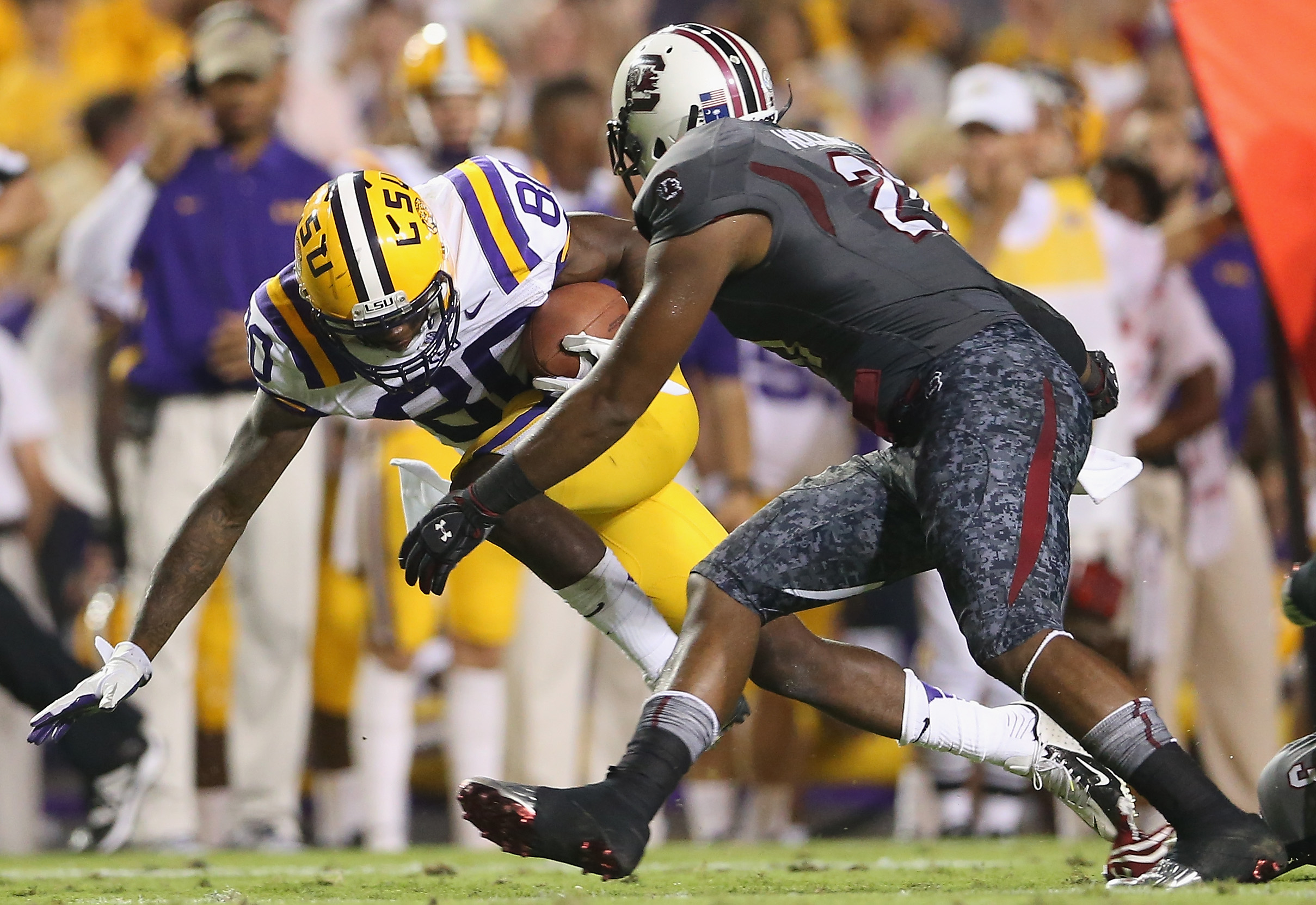
To play LSU, South Carolina dredged up these depressing gray things, shot through with only the merest hint of their red. Seriously, those pants look like a knife wound on dingy camo, like some crappy football-as-war metaphor.
South Carolina v LSU: Oct. 13, 2012

And as you can see from their faces, it was not a successful motivational attempt. They lost. And boy do I hate these. They just... I keep thinking they look like a terrible video game outfit.
Missouri v South Carolina: Sept. 22, 2012

As a comparison, these are South Carolina's usual unis. Or, one of them. Here, they were playing a Missouri team that has given itself a makeover this year, from standard black and gold and an M-stamped helmet to... this. It took me three tries looking at that sucker to see that it's a snarling tiger head; I kept thinking it was laurel leaves or wings or something.
Georgia v Missouri: Sept. 8, 2012

Yes, okay, this is a variation on Missouri's unis -- they look more like bumblebees than tigers to me -- but mostly I just find this football photo hilarious. It's like the Three Stooges or something; there's a trio of Mizzou players there all snuggled and tangled up into a little ball, as if they're about to bring down the runner purely by slapstick accident.
Alabama v Missouri: Oct. 13, 2012

And then we have Tiny Tiger helmet. Somehow it's easier to recognize what it is; I think I like this one better. The team is 3-4, though, with a bye week to recover, so maybe they should consider whipping out their old Big 12 uniforms and stroke them for a while and see if it helps.
Maryland v West Virginia: Sept. 22, 2012
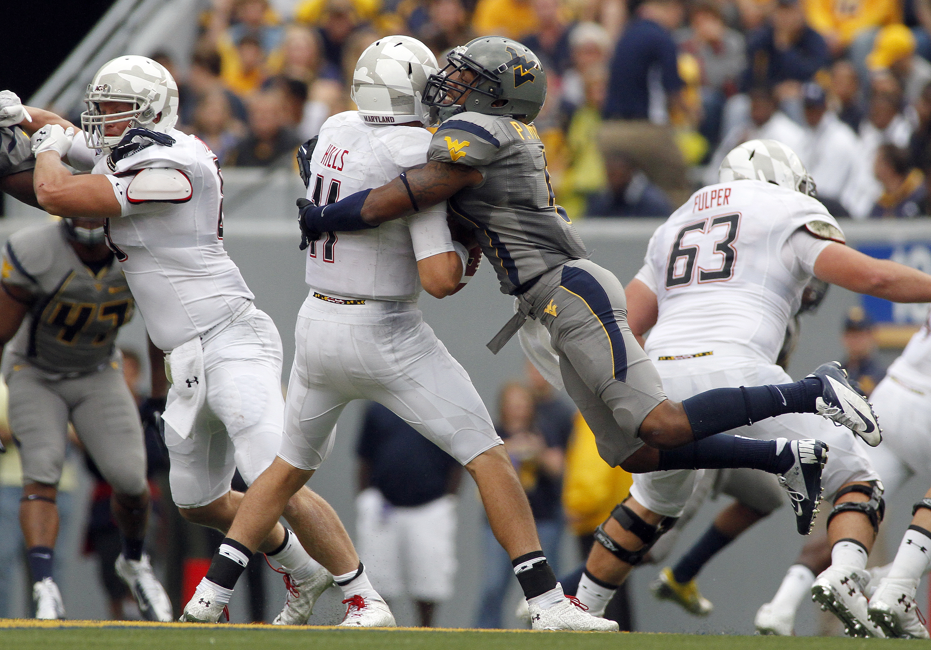
This was a departure for both teams. Maryland decided to call these "White Ops," but they look more like the Michelin intracompany flag football champs. And West Virginia apparently has added grey to its rotation, which... is that really so inspiring? Same with South Carolina, really. What is it about GREY that reads as exciting? Is it that they hope people will associate them with insipid S&M books?
Kentucky v Arkansas: Oct. 13, 2012

AGAIN WITH THE GREY. This is a new wrinkle for Arkansas, too. Apparently all these red-and-white teams have decided thay grey is the future. All fifty damn shades of it. But what I find MOST curious here is that his number is ombre. It fades to blue on the bottom, like it's getting very cold.
Oregon Ducks: All six games so far

I can't even. Oregon's uniforms have been crazy ever since they started wearing different ones every week. The team colors are allegedly forest green and yellow, and now they are forest green, kelly green, two different yellows, some black, a little grey... Next season I fully expect them to unveil Roy G. Biv duds. And I have NO IDEA what is going on with their helmets; they're the Oregon Ducks, so their simple O motif sufficed nicely. Now they look like the Oregon 1970s Cop Show Main Title Graphics.
Miami v Notre Dame: Oct. 6, 2012

You guys, this hurt me so much. First, I hate our pants this season. These are actually more gold than the ones we're wearing regularly, which look like they accidentally got laundered with a bottle of mustard. I miss our shiny gold pants. Second, I could have lived with these specialty uniforms (for our new annual Shamrock Series neutral-site game) if it were the jersey with the gold number. But no. They had to go messing with our helmet. AGAIN.
Miami v Notre Dame

I really hate this. The leprechaun is facing the wrong way, for one thing, and the giant black-and-white thing slapped up on the side of the head is just so unattractive. And there he is again on the pants. Why is there so much HAPPENING here? I'm surprised they didn't go whole hog and stick a shamrock and the interlocking ND on there -- which, by the way, is the best logo we have, so if you're going to get all stampy with stuff, why not use that? Why are we trying to impress recruits by looking like a child's colorforms project?
Miami v Notre Dame

And, what, we can't go halvsies with the helmet because Maryland already did that, so we're going for the fancy 3/4 split? That thing is a migraine. I already practically give myself ulcers during every game; this is not helping.
But, we won, so... the migraine was at least worth it.
But I keep coming back to, why this need to impress recruits and excite your team by wearing stuff that isn't... YOUR stuff? I get that change happens occasionally over the years, but playing in your team colors week after week should be an HONOR, not a source of boredom. Sigh. KIDS TODAY. Get off my blue-and-gold lawn AND TAKE YOUR GREEN JERSEYS WITH YOU.