Venus Williams
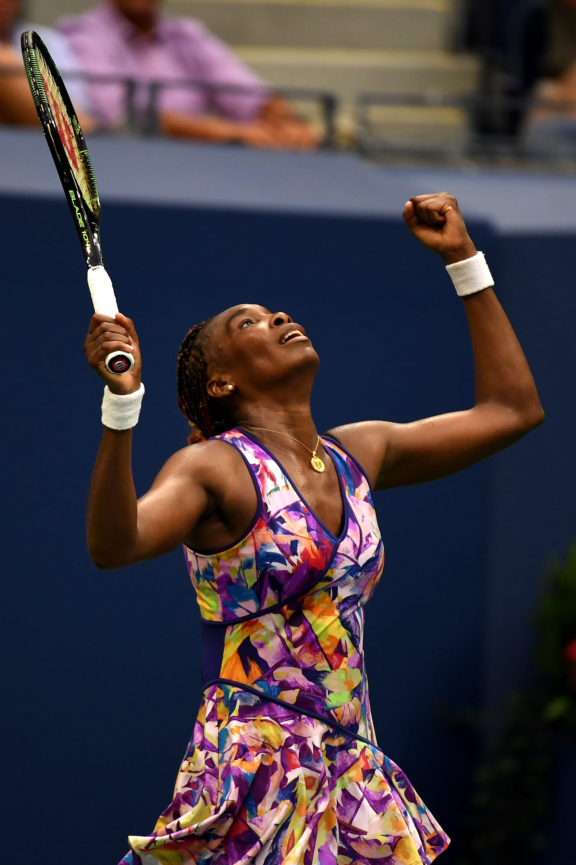
Venus designs her own stuff for her line EleVen. That is legitimately cute and I feel like if she sold it as an actual dress people would buy it for that, too. (The tennis version is a whopping $98. Of course, I have no idea how much non-Venus tennis dresses cost, so maybe that's actually totally normal.)
Venus

I am very easily seduced into downloading good photos.
Serena Williams

It's believed that Serena has a shoulder injury, so maybe she's.... creating easy access for ice packs? Honestly, the arm warmers look like they could be compression that she added to a regular tennis dress. All I know is, the black and hot-pink pleated skirt is fantastic, but the top reminds me vaguely of a swimming rashguard. Nonetheless: WIN, SERENA, WIN.
Roberta Vinci

Nike's controversial Wimbledon nightie was replaced with a pleated skirt, and this looks to be from the same family.
Ellen Perez

The black-and-yellow version is super dramatic. I actually like it better.
Eugenie Bouchard

Genie was one of the only players who went on-record as LIKING the Nike dress as it was, so it's no surprise that she appears to be wearing the neon version. In fairness, it's actually a bit different -- it's not pleated, and seems to move better, and less like it is infantilizing the wearer.
Kyle Edmund

"Oh God it's coming right at me OH GOD WHAT DO I DO."
Suddenly the black marks on this are starting to look like chest hair.
Martin Redlicki, Mackenzie McDonald

These two are a double pack of highlighters, aren't they? Also... is his foot coming out of his shoe there as he goes for the ball, or is it just an optical illusion because of the pattern of his socks?
Anastasia Pavlyuchenkova

That skirt is SO CUTE.
Kristina Mladenovic

The matching strap on the top of the dress version is ALSO good. Well done, Adidas.
Juan Martin del Potro

The Getty photographers often seem to have fun with the dramatic lighting that can result at the US Open. That, or it's the bane of their existences, and they were thrilled Juan Martin here acted as his own beacon.
Stan Wawrinka

I can't tell if that's pink with red, or... what exactly is happening here, as the shorts and shirt hem don't seem to be the same shade. And... is that a tennis ball in his pocket? No, seriously, A sincere question. It... seems important to know the answer.
Janko Tipsarevic

"I CANNOT COMPETE WITH THAT. DON'T EVEN TRY ME."
Camila Giorgi

When I saw this thumbnail I genuinely thought she was wearing a sports bra and a skirt and nothing else.
Kurumi Nara
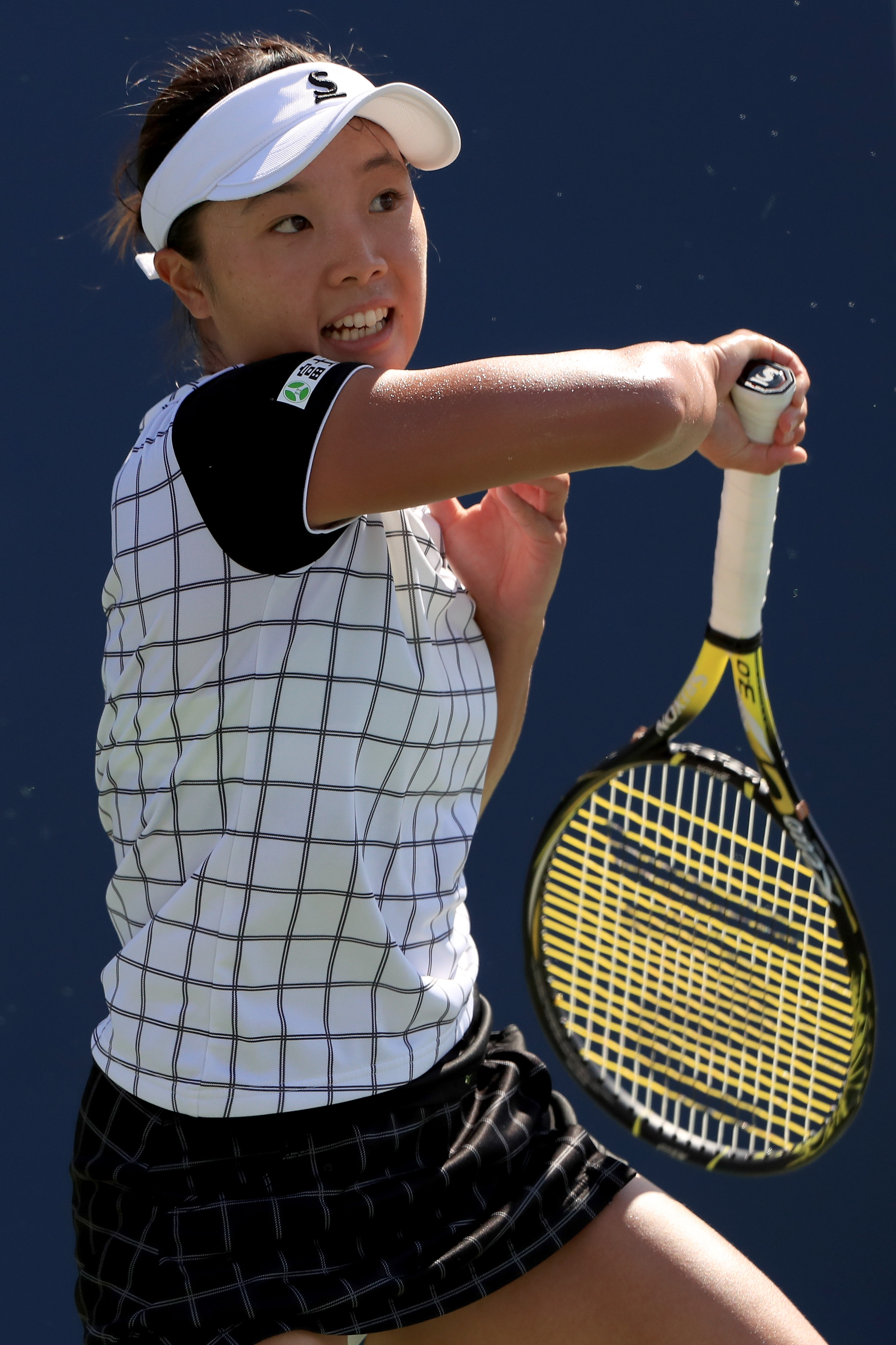
I really like this little checkered number. This is the part where I again remark that I wish I had been a great tennis player and/or had great legs, so that I could invest in cute gear like this. I have no problem with people trying to make tennis clothes cute -- much as I think it's fine to wear awesome lipstick at the Olympics -- as long as they don't interfere with your physical job. If you want to feel both cute AND powerful when you're out there hitting 100 mph serves and completing acts of athletic prowess, that is fine by me.
Misaki Doi

I BELIEVE this is the same manufacturer, and no surprise: I'm here for the orange version, too.
Naomi Broady

And y'all know I love a pattern. They should make one that's an ACTUAL adult coloring book, and she can fill in a different part of it with each match she wins.
Anna-Lena Friedsam

I love that there's also a photonegative option.
Caroline Wozniacki

This is funky, but in a weird way the lines of it weren't that flattering. Which doesn't really matter -- like, I'm sure it was the absolute last of her concerns -- but whatever. Regular people who might want to invest in tennis dresses are probably pondering such things.
Andrea Petkovic

This version is better, methinks?
Heather Watson
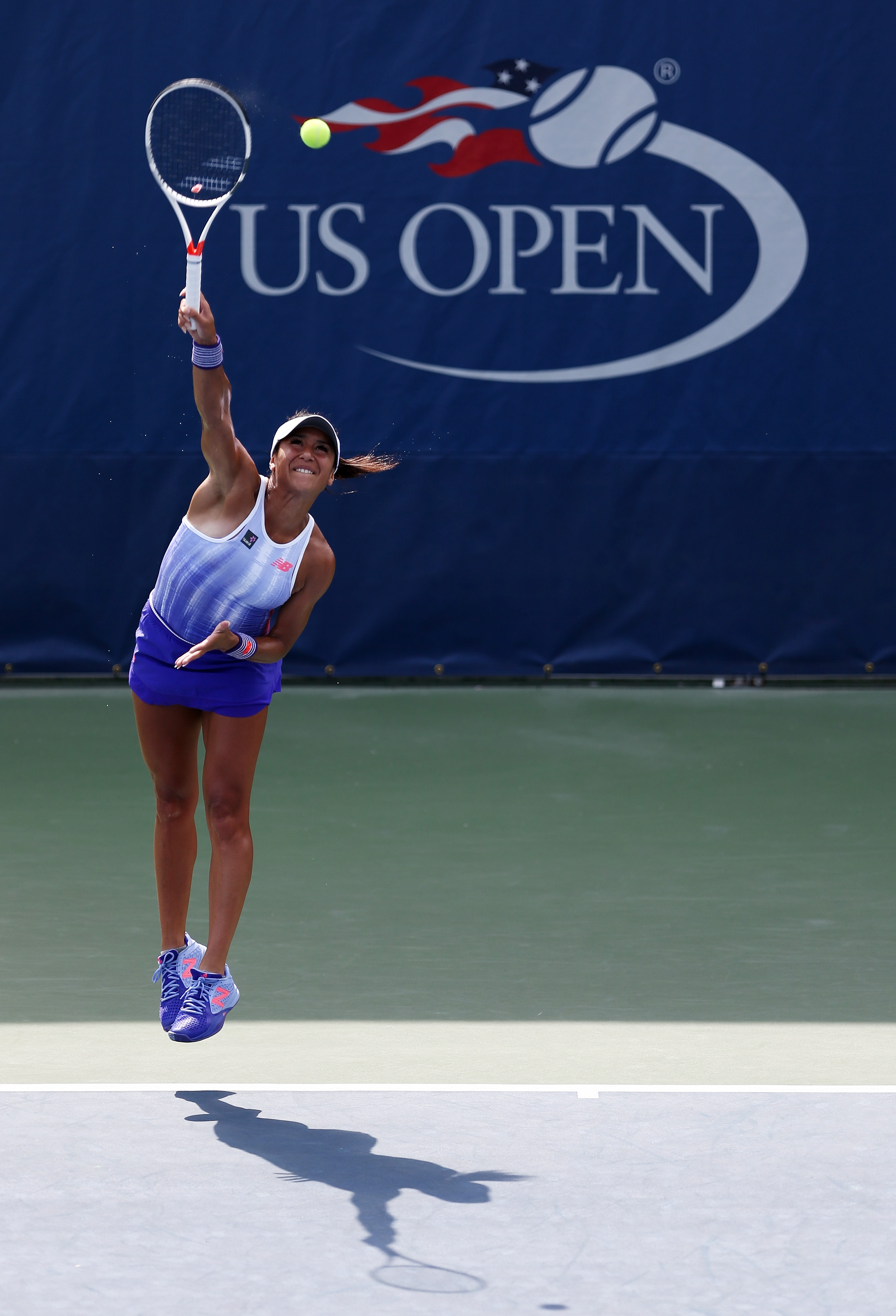
I love that the shoes complete the effect here. I also love watching these people serve. I took tennis lessons as a kid, and -- like with so many things -- I realized I was never going to be great at it, so I stopped. (REGRETS.) The mechanics and physics of hitting a powerful serve were just beyond my skills at that time. Bending back and exploding and using your knees... it wasn't me. I serve like an oak tree.
Christina McHale

Even her BRAID has achieved ore liftoff than I could.
Jelena Jankovic

Simple but effective.
Karolina Pliskova

Ditto. Creativity is great, but also, no need to overthink things in this case. It's tennis wear. Simpler can be better.
Bethanie Mattek-Sands
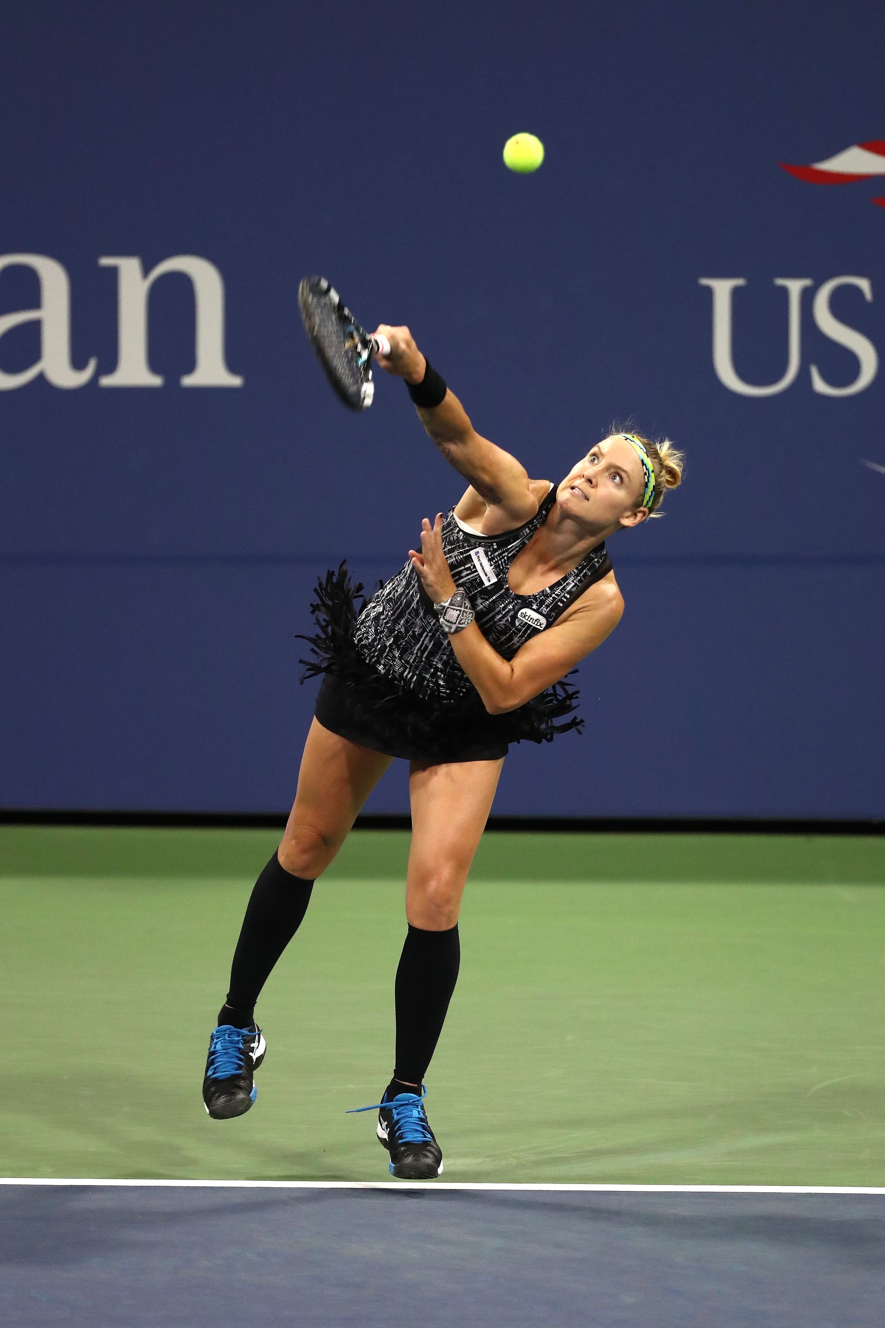
She can always be counted upon for fringe and knee socks.
Svetlana Kuznetsova

This one seems a little off to me. Too weirdly frilly, and what look like arrows on her chest. Pass.
Monica Niculescu
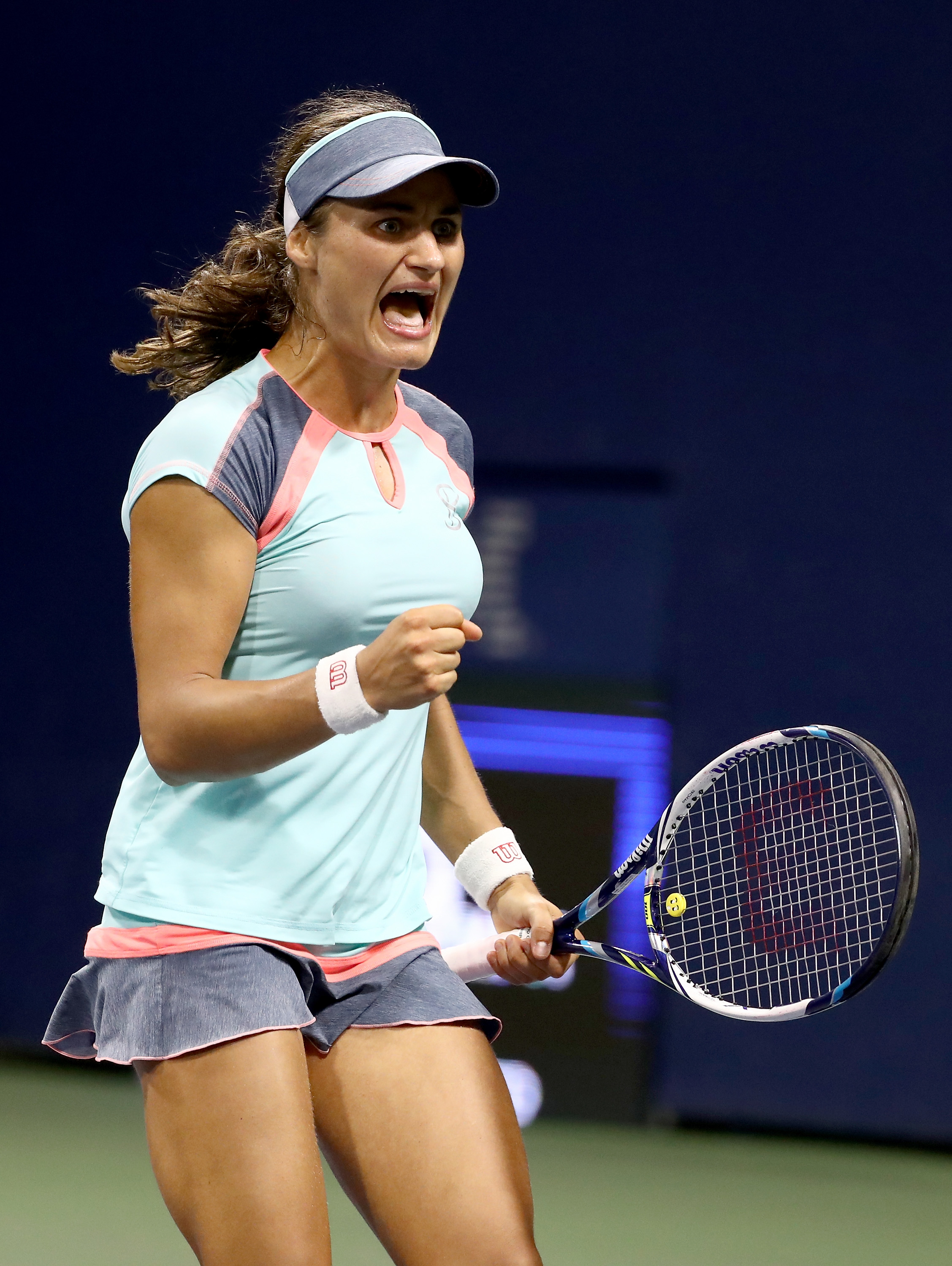
Not my favorite color combo.
Novak Djokovic

So... what exactly are you getting at, Novak?
Rafa

"MINE."
Rafa Nadal

Something about this shot really makes me laugh. The combo of the grip and the intensity and rigidity almost looks like he's never used a tennis racket before, and is terrified, and has just decided to club the ball as hard as he can in whatever direction.
Ernesto Escobedo

That looks like someone ran him over with a golf cart.
Milos Raonic

He's got an array of stripey shirts, making him a Friend of Fug Nation for sure.
Milos Raonic

This one is more minty/aqua than it appears on the screen here.
Ryan Harrison

As I type, he's locked in a gritty -- and also mutually exhausting, it seems -- match with Milos Raonic, and all I know for sure about it is that Ryan reminds me of Young Maxwell Caulfield. We'll soon know if he's also a Cool Rider.
Dustin Brown

Why hello there.
John Isner

Again, very basic stripes. Fila seems to have kept it simple this year.
John Isner, Francis Tiafoe

"I'm so tired. I just... please can I rest my head here for a minute?"
David Ferrer

I like his pink shirt, and WOW, does he look worked-out. (And intense, and pleased.)
John Millman

"Primary colors FOR THE WIN."
Vasek Pospisil

The blue seems very out of place with the rest of the color scheme. But I like his shirt, and also that his name sounds like an ad for something that has 75 sound effects ranging from mild headache to probably death by liquefaction.
Damir Dzumhur

"TA-DA! KHAKI IS WACKY, Y'ALL! FEEL THE JUICE!"
Damir Dzumhur

Holy cow. If I tried this, my crotch would actually drop clean off my body.
Phil Collins

And then Phil Collins showed up. (This actually explains ESPN's puzzling use of "Take Me Home" to bump out to commercial during the coverage.)
Leslie Odom Jr.

And THEN Aaron Burr showed up and was like, "There's nothing rich folks love more than going to Flushing Meadows and hearing 'Easy Lover' some more."