Elizabeth Banks in Andrew Gn
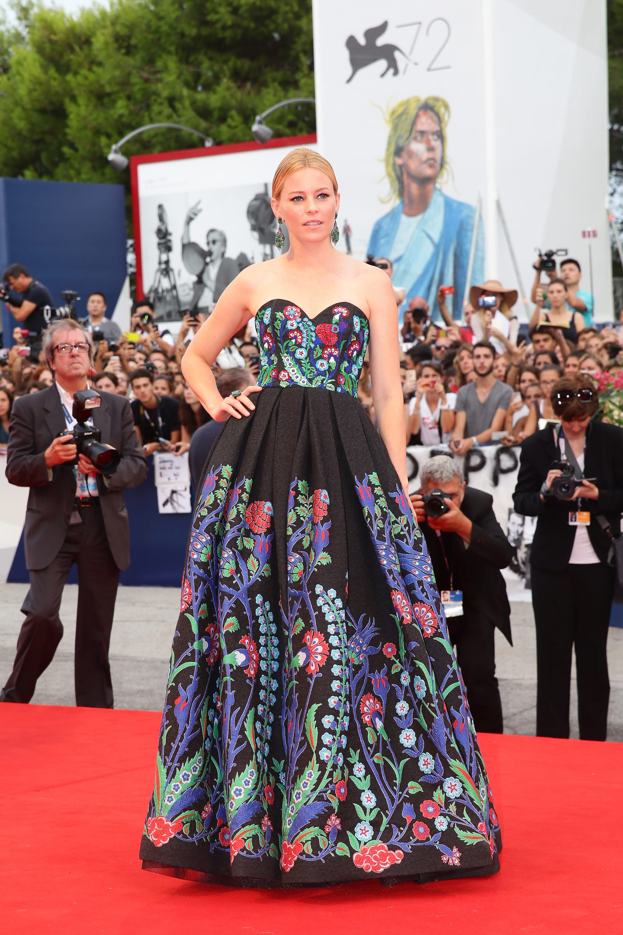
This one is a toughie to me. I think the pattern is EXTREMELY cool and I love the brightness against the dramatic black. But it's an unfug for me. I get that the blossoms are supposed to be growing up to the sky, but having everything fade to black at her waist looks more unsightly this way -- like a dye accident. If the bodice were all black, it might make the skirt stand out more -- or, all black, but with a little fold along the top that mirrors the pattern, or some other smidgen but not the entire thing. Or maybe you keep the bodice as-is but make LESS empty space between it and the skirt's flowers. My other beef is with the sweetheart neckline. I think you have to tread carefully with those because they never look retro to me so much as stuffy and twee, and I think this would've felt more modern to me with something squared off and simpler. But I LOVE the bones of this, and obviously I am delighted Elizabeth Banks went SO SO BIG here.
Elizabeth Banks

The shape of that skirt is delectable from the back.
Elizabeth Banks

Also, I love a gown that requires the wearer to scoop it up to walk. It's suddenly Cannes up in this joint.
This picture reminds me that I'd have liked more color in the lip, too. When is that NOT the case, though.
Elizabeth Banks in Marchesa

... well, it's better than a lot of Marchesa, but it's still not exactly my dream dress. The cut and the shape of the details isn't as flattering as I want it to be, plus the little sneeze guard of a ruffle/train at the bottom feels so bridal. It's like somewhere she has a doll wearing the EXACT SAME THING, both made by an elderly -- if also accomplished at the sewing machine -- former relative. And said doll is currently engaged to two stuffed animals and a Ken whose head is jammed on backward, and no one is sure which one the doll will choose. It's tense in that playroom.
Elizabeth Banks
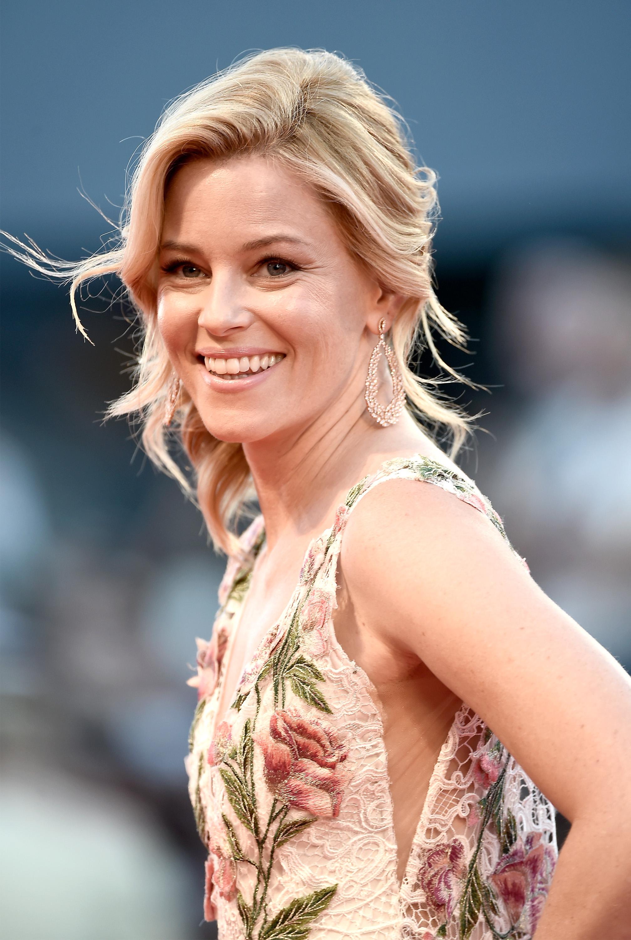
Two words: LIP COLOR. I just don't want her lovely face to look washed out.