Regina King
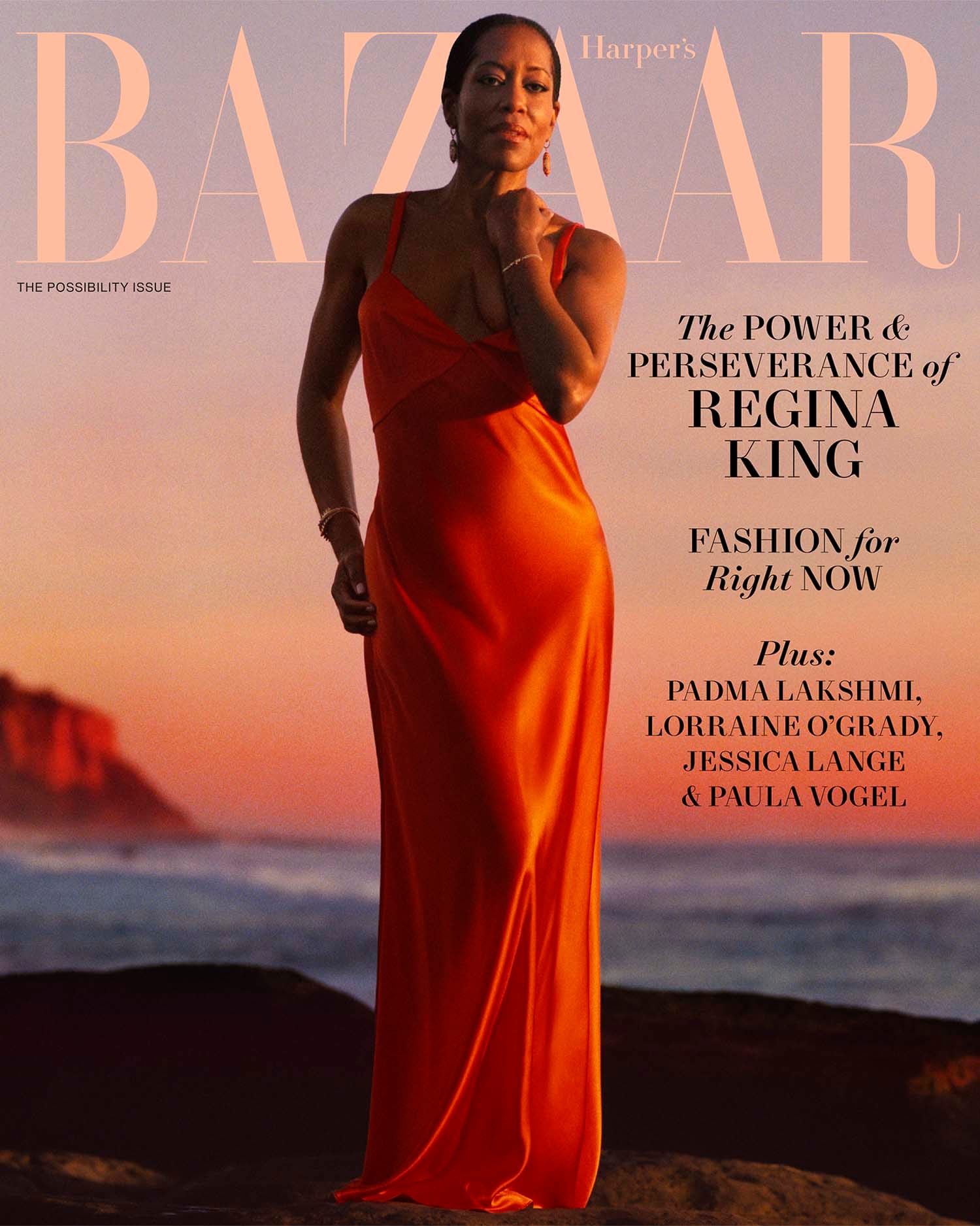
I want to love this photo, but I do not fully understand the lighting choices. Especially for a cover of something as optimistic as THE POSSIBILITY ISSUE. This doesn't feel like the sun rising; it feels like it going down, somehow. This vibe, despite being a gorgeous orange, has the blues.

I also don't think either of these are fabulous of her face, which is itself fabulous.

This would have been my cover pick. It's rich in color, the light on her feels hopeful, and her profile also has warmth to it.

This is the one they never would have chosen but that I secretly think is the most fun. Subscriber cover!!

They were really into this gritty, darker light. I guess the sun WAS going down? Or maybe they did this before it came up, my god, where is the keg of coffee.

"Did you guys pack the beach doorway?!? Don't forget the beach doorway!!!"

This... feels so personal and almost spiritual. If I were her, I would frame that.

I am excited to see her act again.

I wish we could see this dress in color. They were ALSO very hot for black and white.

It's interesting how many photos they chose that look like she's transitioning between poses -- this one and the last one, particularly, her face seems like she's figuring out what to do next.

PEEKABOO.

She has such presence.

And I wanted to end it on a joyful note. That also would have made a truly lovely, affecting cover, but I also get why it might have made the poignancy of the profile come as more of a surprise.