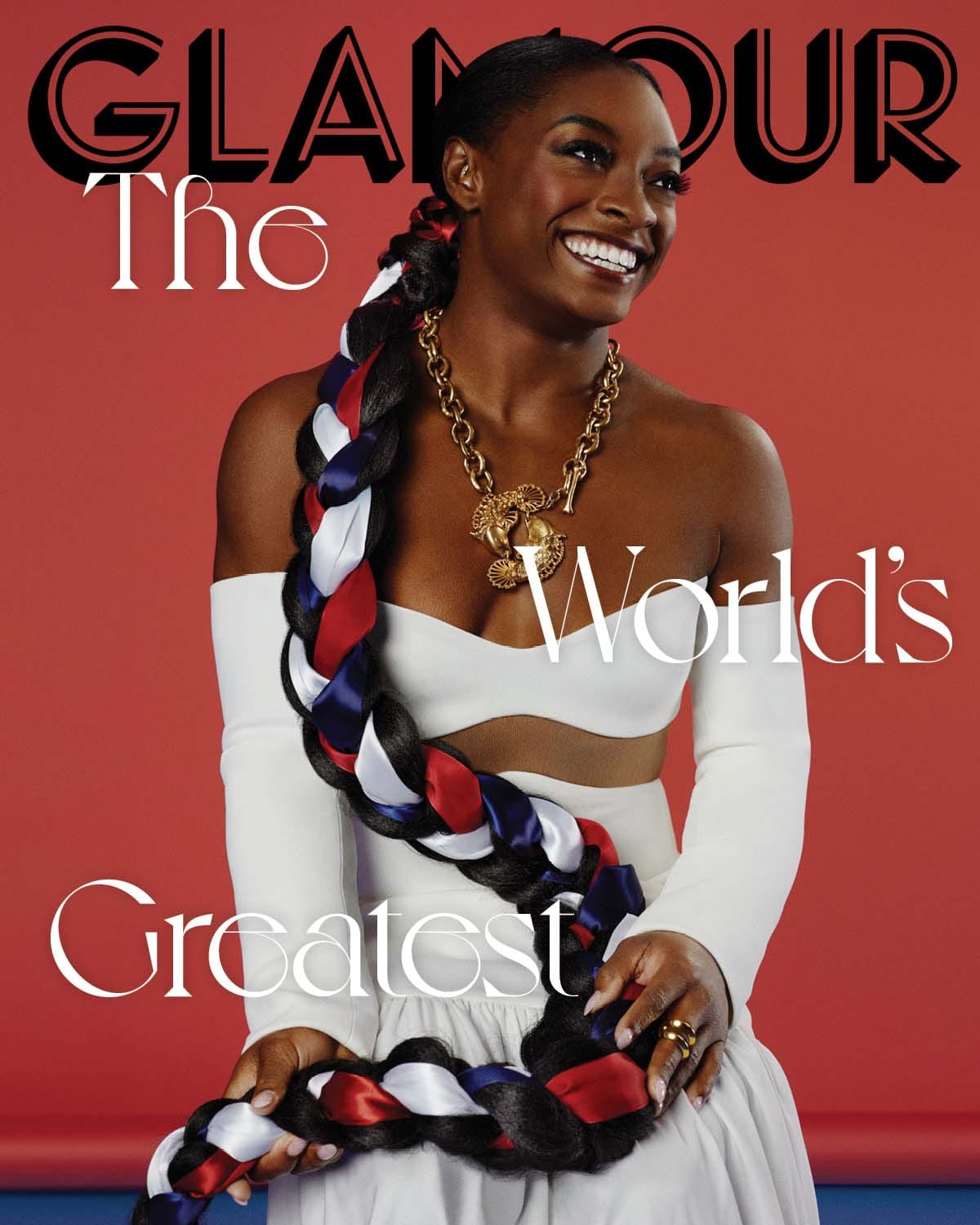
I just love her. I emphatically do NOT like the font or the way they've placed the words. I don't like it stepping on the masthead. I don't like that "Greatest" gets lost. The whole looks silly, like a loading error in their pagination software, or something. She is doing her part. Was that the best Glamour could do with it?

I also think she looks magnificent here, and yet they've staged her so that it appears she might be perching on a gold toilet.

This is a wonderful fusion of glamour and power.

I LOVE the motion in this (and how the ribbons evoke rhythmic gymnastics). It's an almost-perfect photo; she just looks a little bored, is all.

But, she is fabulous. We do not deserve her. I hope she decimates the competition in Tokyo.
Simone Biles Glows on Glamour
YAY.