Lily Gladstone in Gucci
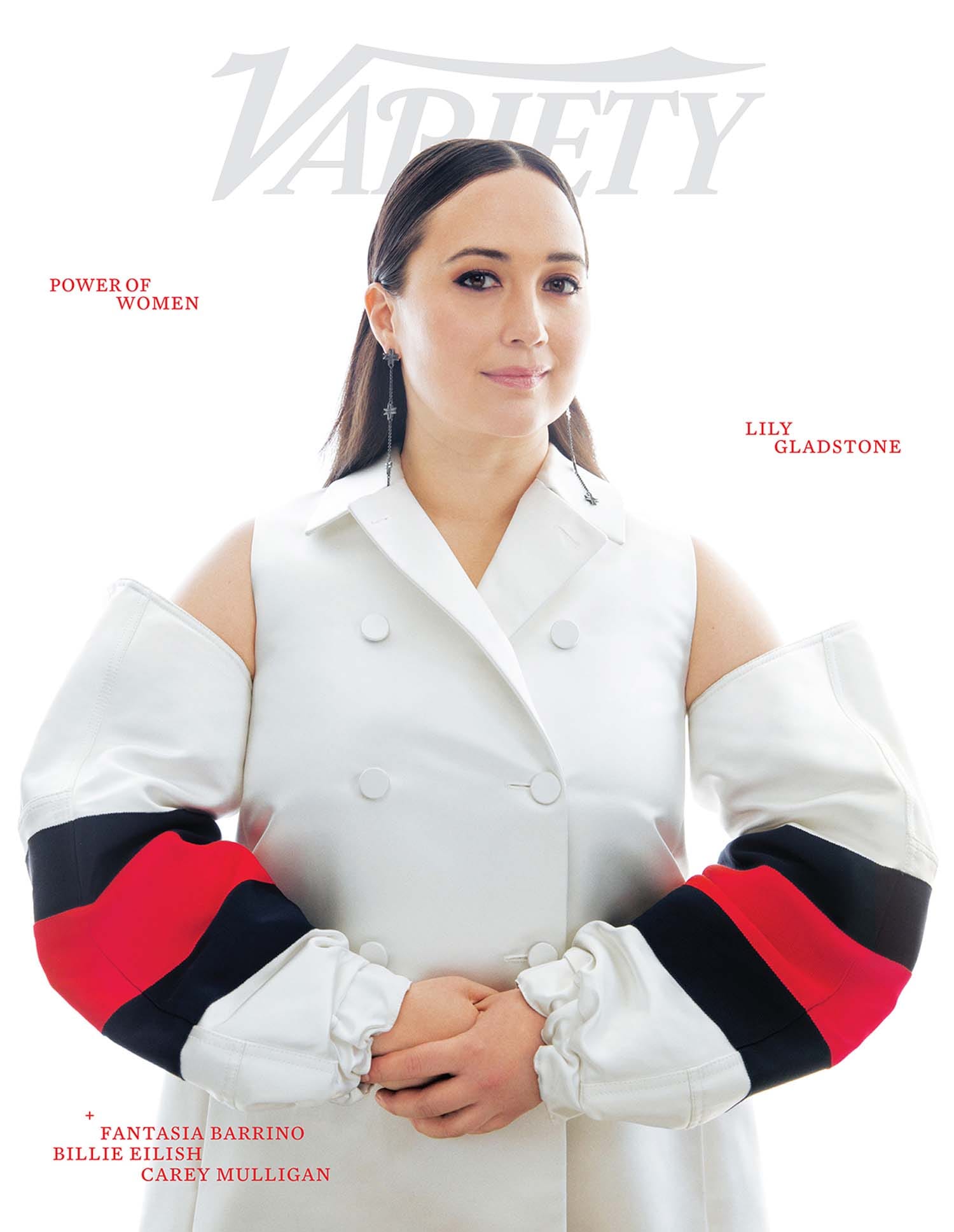
I really... do not like this. I am not feeling any of it. The weirdo bag sleeves look like they ripped off when she moved her arms down, and she looks like she cannot stand comfortably.
Lily in J Okuma

This is the photo that leads off the article, and J. Okuma is an indigenous designer, which is nice to see and would have been welcome on the cover. I don't love the photo angle, but I'm impressed that she is working it as well as she is.
Lily Gladstone
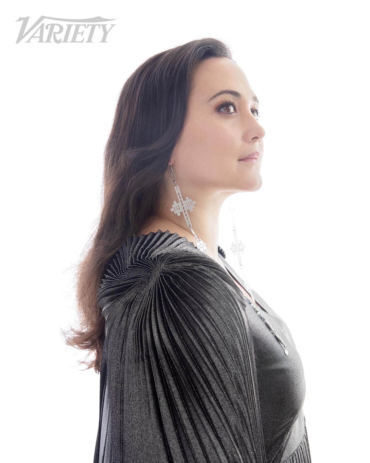
This feels very romantic, and evokes the feeling of what's actually happening to her -- namely, that she's walking into the spotlight.
Fantasia

We only got the covers of Fantasia and Billie; no bonus pics. Fantasia looks beautiful, and it's also that same aura of her straightening her jacket and readying herself for what's coming.
Billie Eilish

Interesting that Lily is the only one who got any color in her cover; the rest are all black and white. Billie gets the red on her scalp, which I guess sort of links to the red on Lily's sleeves, so maybe that's all part of the thematic decision.
Carey Mulligan

I enjoy her hair and makeup here, for sure. I actually also like the coat -- this is all striking.
Carey Mulligan
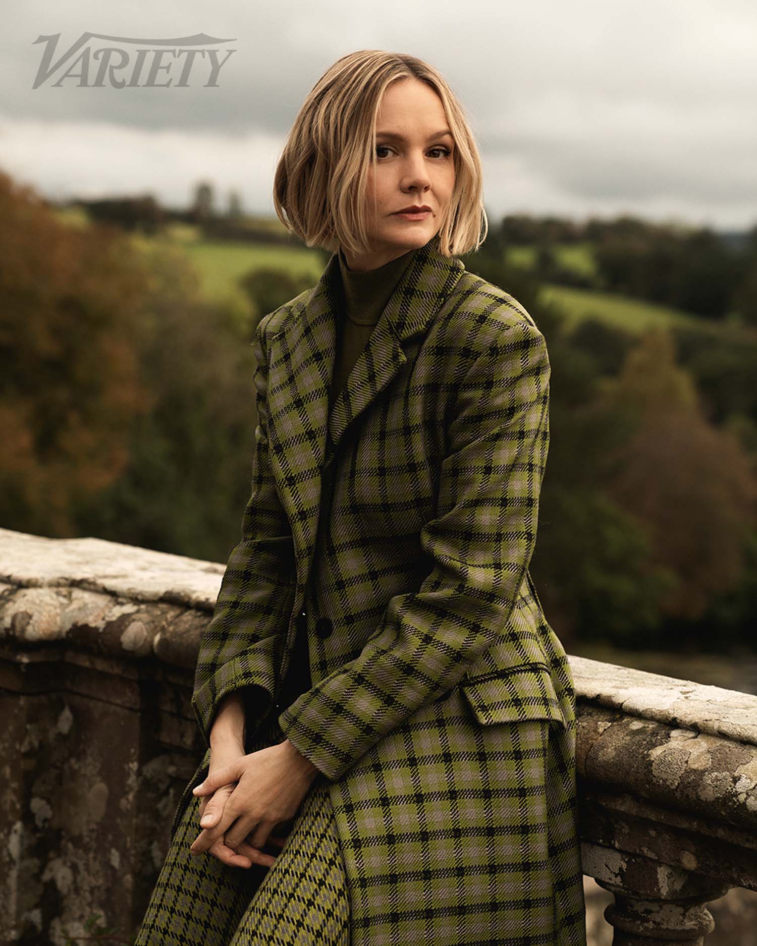
It is also nice to see her in a print.

But, he mood in all three photos is Bored and Posh; ironically, it could use more variety.